What if Google Existed in the 1970s?
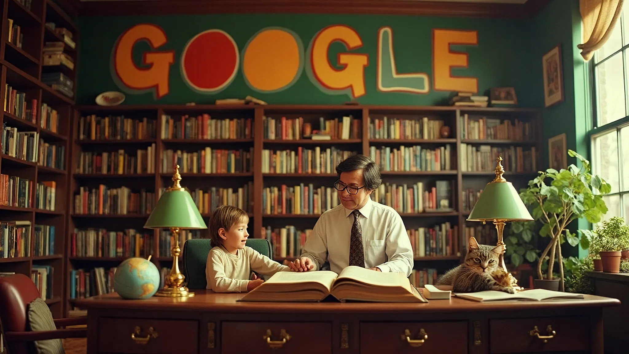
Imagine walking down a busy high street in 1974. Between the record shops and the laundrettes, you spot something unexpected: a library & information called Google. It shouldn't exist — not for another few decades — but here it is, fitting in perfectly among the brown brick and hand-painted signage of the era.
The world's knowledge, card-catalogued and cross-referenced in a temple of search that smelled of old paper and warm transistors. Vintage terminals hummed alongside towering wooden bookshelves, each section labelled in the familiar primary colours. You filled out a query slip, handed it to the librarian, and within minutes the answer appeared on a dot-matrix printout. Feeling lucky was not a button; it was a way of life.
The Details That Sell the Illusion
Every Modern Retro storefront is built from the visual language of the 1970s — warm tungsten lighting, Kodachrome film tones, wood panelling, and period typography. Here's what makes the Google store feel authentic:
- Towering oak bookshelves with rolling library ladders
- Vintage CRT computer terminals on wooden desks
- Primary-colour signage matching the brand palette
- Card catalogue cabinets in polished walnut
- Green banker's lamps on each research station
The Absurdity Factor
Part of the charm of Modern Retro is the contrast between what a brand does today and what it would have been in the 70s. Google as a library & information is perfectly natural — the kind of shop you'd walk past without a second glance, never knowing that decades later it would become something entirely different.
That tension between the familiar and the impossible is what makes these images work. They're not parodies — they're love letters to an era when everything was a bit more tactile, a bit more human, and a lot more orange.
Like what you see?
View the full store page, order a print, or create your own retro storefront.